Before pouring money into ads, you have to get your own house in order. Many small businesses are frustrated with their sales, but the root of the problem is a “leaky bucket”—they work hard to get visitors, but their website is full of friction points that drive those potential customers away. The implication of fixing these internal issues first is profound: every dollar you later spend on marketing will yield a higher return because your site is actually ready to convert traffic into sales.
The first, and most important, step is to conduct a thorough audit of your website to know how to increase online sales.
This isn’t about a massive, expensive redesign. It’s about putting on your customer’s hat and walking through your site, step-by-step, to find and fix the things that are causing frustration and killing sales. From the moment they land on your homepage to the second they click “complete purchase,” that path needs to be as smooth as possible.
Diagnosing Customer Journey Friction
Where are people giving up? Your analytics are a treasure map pointing directly to your biggest growth opportunities. By looking at user behavior flows, you can see the exact pages where you’re losing the most people. This data provides actionable insights into customer pain points.
Common culprits include:
- Confusing Navigation: If a user can’t find what they’re looking for in a couple of clicks, they’re gone. A simple, clear menu is non-negotiable for a good user experience. Practical Example: A visitor lands on an electronics store looking for “headphones.” If the main menu has vague terms like “Products” instead of clear categories like “Audio” or “Headphones,” the user will likely leave.
- Slow Site Speed: A delay of just one or two seconds in page load time sends bounce rates soaring. The implication is that you lose potential customers before they even see your products.
- Unclear Value Proposition: A visitor should know exactly what you do and why they should care within five seconds. If they have to hunt for it, you’ve already lost.
- Complicated Checkout Process: Too many fields, too many steps, or asking for unnecessary information is a guaranteed way to spike your cart abandonment rate.
This isn’t a one-and-done task. It’s a continuous cycle of auditing your site’s performance, optimizing based on what you find, and converting more of the visitors you already have.
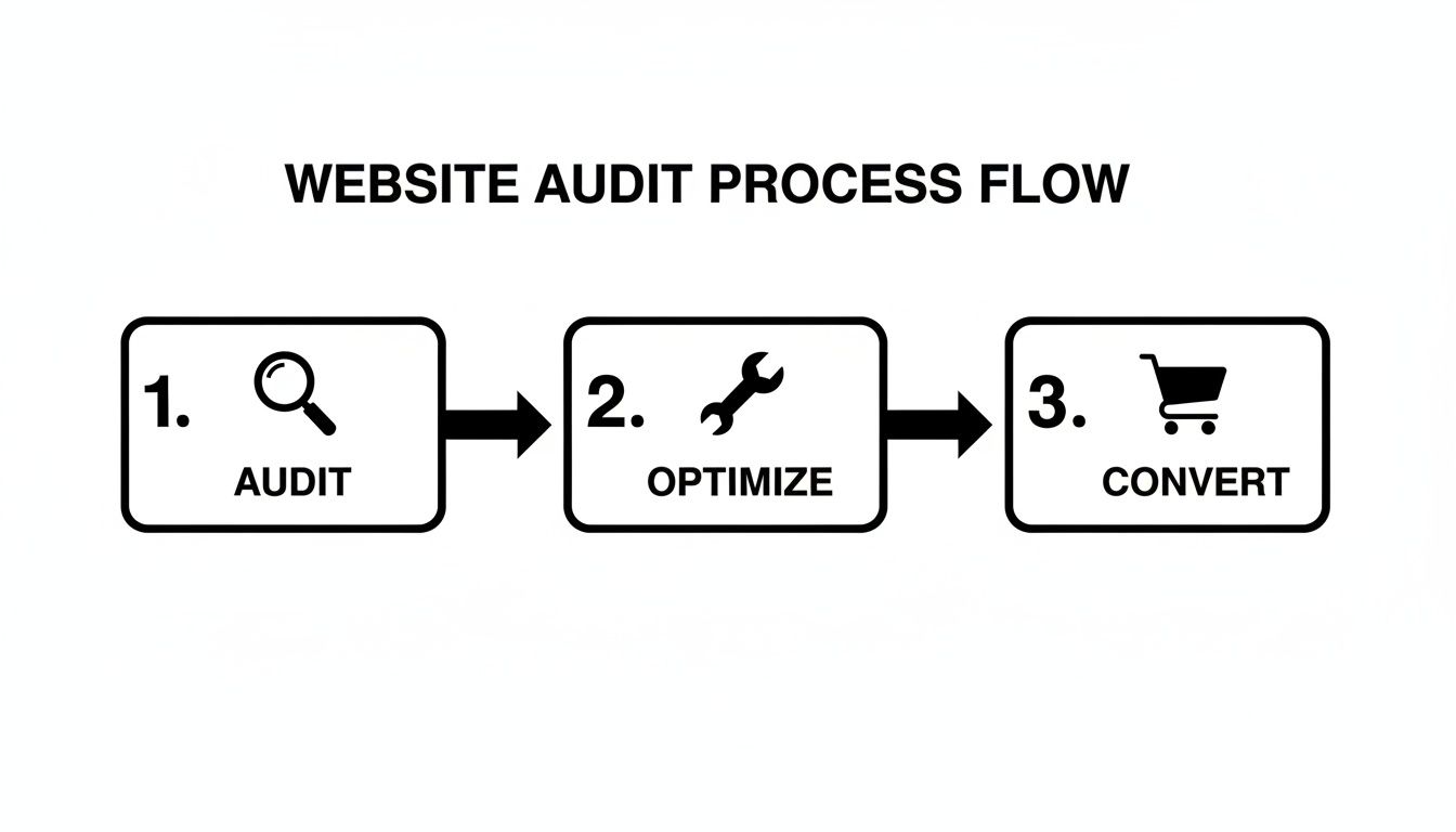
The primary benefit of this cycle is achieving sustainable growth by improving the efficiency of your existing traffic, which is far more cost-effective than constantly paying for new visitors.
Implementing Quick Wins for Immediate Impact
Once you know where the problems are, you can start implementing high-impact fixes. For a deeper look at the core principles of a high-performing site, our guide on small business website design tips is a great place to start.
A great website isn’t just about looking good; it’s a sales tool designed to build trust and guide visitors to action. Every element, from security badges to customer reviews, plays a role in overcoming hesitation and securing the sale.
Focus on building trust from the very first click. Prominently display trust signals like SSL security badges, customer testimonials, and a clear, easy-to-find return policy. The benefit of these small elements is immense: they reassure anxious buyers that their information is safe and their purchase is risk-free, directly impacting conversion rates.
By tackling these foundational issues first, you build a solid platform that’s ready to handle—and convert—an increase in traffic. This is how you set the stage for real, sustainable growth.
Quick Wins Checklist to Increase Sales
Feeling overwhelmed? Here are a few actionable insights you can tackle right now to start plugging those leaks and seeing better results.
| Area of Focus | Actionable Task | Benefit & Practical Impact |
|---|---|---|
| Site Speed | Compress images on your top 5 landing pages using a tool like TinyPNG. | High – Faster load times immediately lower bounce rates and improve user experience, keeping more visitors on your site. |
| Trust Signals | Add customer testimonials or reviews to your product and checkout pages. | High – Builds social proof and reduces purchase anxiety. A customer seeing a 5-star review is more likely to trust the product and complete the purchase. |
| Navigation | Review your main menu. Are the labels simple and clear? Can a new visitor understand them? | Medium – Improves user experience. Clear labels like “Men’s Shoes” vs. “Footwear Solutions” help people find products faster. |
| Value Proposition | Read your homepage headline out loud. Is it clear what you sell and for whom? Rewrite it to be simpler. | High – Immediately grabs the right audience’s attention. “Handmade Leather Wallets for Men” is better than “Artisanal Pocket Accessories.” |
| Checkout | Go through your own checkout. Can you remove any non-essential form fields? | High – A shorter process directly reduces cart abandonment. Removing the “confirm password” field is a classic example of reducing friction. |
Picking just one or two of these to implement this week is a fantastic start. Small, consistent improvements are what build a truly effective online store over time.
Winning with a Mobile-First Commerce Experience
Think about it: for millions of people, the smartphone is the main storefront they use every day. If your online store treats the mobile experience as an afterthought, you’re not just providing a subpar experience—you’re actively showing the majority of your potential customers the door. A mobile-first approach is about meticulously designing a fast, intuitive shopping journey specifically for that small screen.
This isn’t a small trend; it’s a monumental shift. By 2025, mobile ecommerce sales are projected to smash $2.51 trillion globally. The implication is clear: if you want to increase online sales, you must win on mobile. The biggest killer? Speed. If your page takes longer than three seconds to load on a phone, you lose over half your visitors. You can discover more insights on the future of ecommerce to see just how critical this is.
Responsive vs. Mobile-First: A Key Comparison
It’s easy to get these two confused, but their differences have significant implications for your sales.
| Approach | Design Philosophy | User Experience Outcome | Business Implication |
|---|---|---|---|
| Responsive Design | Starts with a desktop site and shrinks it to fit a mobile screen. | Often results in clunky navigation, tiny text, and difficult-to-tap buttons. It’s a compromised experience. | Higher bounce rates and lower conversion rates on mobile devices due to user frustration. |
| Mobile-First Design | Starts by designing the simplest, most essential version for a mobile screen, then scales up. | A faster, cleaner, more focused experience that prioritizes the core user journey. | Lower bounce rates and higher mobile conversions because the site is built for how the majority of users shop. |
The real magic of a mobile-first approach is that it forces you to prioritize what truly matters. It cuts through the noise and puts your core message, key products, and the path to purchase front and center. The result is a faster, more focused shopping experience that actually converts.
Nailing the Mobile Customer Journey
Creating a winning mobile experience comes down to sweating the small stuff—the specific nuances of how people browse and buy on their phones.
- Rethink Your Navigation: On mobile, you need a clean “hamburger” menu, obvious icons, and a prominent search bar. The goal is to get people where they want to go with the fewest taps possible.
- Design for Thumbs: Place your most important buttons—like “Add to Cart” and “Checkout”—in easy-to-reach zones. Practical Example: An e-commerce app that places its main navigation buttons along the bottom of the screen (within the “thumb zone”) will be far easier to use than one with buttons at the top, which requires awkward stretching.
- Make Checkout Effortless: A clunky mobile checkout is where sales go to die. Implement one-click payment options like Apple Pay, Google Pay, and Shop Pay. The benefit is a dramatic reduction in cart abandonment, as users can bypass manually typing in shipping and credit card details.
Tools like Google’s PageSpeed Insights are invaluable here. They provide an actionable report card on your site’s mobile performance.
This report breaks down critical metrics like Core Web Vitals, showing you exactly where your mobile site is lagging in speed and user experience.
Use Technology to Your Advantage
Great design is only half the battle. Your product images need to be lean and mean. Using modern image formats like WebP can drastically reduce file sizes without sacrificing quality. The benefit is that your pages snap to life even on a spotty cellular connection, retaining visitors who would otherwise leave.
Another powerful tool is Accelerated Mobile Pages (AMP). AMP is a framework for creating stripped-down, lightning-fast versions of your web pages. For product or category pages that get a lot of traffic from Google search, implementing AMP can mean the page loads almost instantly. This dramatically cuts down your bounce rate and smoothly guides more searchers into your sales funnel.
Driving Organic Traffic with Strategic Ecommerce SEO
You can have the most beautiful online store, but if nobody can find it, it’s invisible. Search Engine Optimization (SEO) is the process of helping Google lead hungry shoppers right to your digital doorstep. The primary benefit of SEO is that it builds a reliable, long-term stream of high-intent customers for free, reducing your reliance on paid advertising.
It all starts with on-page SEO—optimizing elements directly on your website, like product and category pages. Your page titles and meta descriptions are your first impression on Google. They need to be sharp enough to rank well and compelling enough to make someone click your link over your competitors.
Uncovering Customer Intent with Keyword Research
Before you start tweaking, you have to get inside your customers’ heads. Keyword research is the difference between guessing and knowing. Tools like Google Keyword Planner let you see what people are searching for, how often, and how competitive those terms are. This data provides actionable insights for your entire content strategy.
Key Comparison: Broad vs. Long-Tail Keywords
| Keyword Type | Example | Search Volume | User Intent | Implication for Sales |
|---|---|---|---|---|
| Broad | “leather bags” | High | Low (Browsing, researching) | Lower conversion rate; user is early in the buying journey. |
| Long-Tail | “handmade brown leather crossbody bag” | Low | High (Ready to buy) | Higher conversion rate; user knows exactly what they want. |
Targeting long-tail keywords is a classic small business power move. They might have lower search numbers individually, but they attract shoppers who are much further along in their buying journey. The conversion rates are almost always higher because the search intent is crystal clear.
This research helps you prioritize efforts on terms most likely to drive actual sales.
The Power of Local SEO for Brick-and-Mortar Businesses
If you have a physical storefront, local SEO is a must. A staggering number of “near me” searches lead to a sale within 24 hours. Your best friend here is your Google Business Profile (GBP). An optimized profile gives local searchers everything they need to pick you, right on the search results page: your address, hours, photos, and a steady flow of fresh, positive customer reviews. The benefit is increased foot traffic and local sales from customers actively searching for businesses like yours in the area.
Building Authority Through Site Structure
Finally, a clean, logical site structure with smart internal linking helps search engines understand your site’s hierarchy. Practical Example: A link from your homepage (your most powerful page) to a specific product category is like a vote of confidence. Linking from a blog post about “how to care for leather shoes” to your actual leather shoe products creates a helpful, relevant path for both users and search engine crawlers. This spiderweb of internal links distributes authority, guiding visitors and helping Google index your pages more effectively. For a step-by-step guide, our business SEO cheat sheet is the perfect starting point.
Turning Clicks into Customers with Smart CRO
Getting people to your website is only half the game. The real magic is in turning those visitors into paying customers. This is Conversion Rate Optimization (CRO), and it’s about making smart, data-backed tweaks to your site to get more people to take action. The main benefit of CRO is making more money from the traffic you already have, which maximizes the ROI of all your marketing efforts.
A/B Testing Your Way to Higher Sales
The engine of CRO is A/B testing. The concept is simple: you create two versions of a page (an ‘A’ version and a ‘B’ version), show them to different groups of visitors, and see which one performs better. This provides actionable data, replacing guesswork with evidence.
The real power of A/B testing isn’t just finding a single “winner.” It’s about creating a culture of constant improvement. Every test, win or lose, teaches you something valuable about what your customers want.
Practical Example: An online candle shop tests two headlines on their product page:
- Version A (The Original): “Hand-Poured Soy Wax Candle” (Feature-focused)
- Version B (The Challenger): “Relax and Unwind with Our Calming Lavender Soy Candle” (Benefit-focused)
The implication of this simple text change can be significant. Version B, which sells the benefit (relaxation) instead of just the feature (soy wax), might easily see a 15% lift in add-to-cart clicks, directly leading to more sales.
CRO Testing Ideas by Impact Level
This table prioritizes common A/B tests, categorized by their potential to move the needle. Start with “High Impact, Low Difficulty” for the fastest results.
| Test Idea | Potential Impact | Difficulty | Actionable Insight |
|---|---|---|---|
| Change CTA Button Color & Text | High | Low | Test benefit-oriented text like “Get Your Free Guide” vs. “Download Now.” |
| Add Trust Badges (e.g., Secure Checkout) | High | Low | Adding a “Verified Secure” icon near the checkout button can reduce anxiety and boost completions. |
| Simplify Checkout Form Fields | High | Medium | Remove non-essential fields. Every field you cut makes a purchase more likely. |
| Add Customer Reviews to Product Pages | High | Medium | Social proof is powerful. Test placing reviews directly below the product title. |
| Implement a One-Click Checkout Option | High | High | Options like Apple Pay reduce friction dramatically, a key driver of mobile conversions. |
Crafting Calls-to-Action That Actually Work
Your Call-to-Action (CTA) is arguably the most important button on any page. A great CTA is specific, uses an action verb, and instantly communicates value.
Key Comparison: Weak vs. Strong CTAs
| Weak CTA | Strong CTA | The Difference |
|---|---|---|
| “Submit” | “Get My Free Quote Now” | Specificity and value. |
| “Shop” | “Explore the New Collection” | Evokes curiosity and excitement. |
| “Learn More” | “See Pricing and Plans” | Clarity. It matches user intent. |
The secret is to match the button’s text to what the user is actually trying to accomplish.
Streamlining the Checkout to Slash Abandonment
Nearly 70% of all online shopping carts are abandoned. The number one reason? Friction. Here are a few quick wins to plug the leaks:
- Offer Guest Checkout: Forcing account creation is a major conversion killer.
- Ditch Unnecessary Form Fields: Be ruthless. Do you really need their phone number?
- Use a Progress Bar: Show people where they are in the process (e.g., Shipping > Payment > Review). The benefit is reduced user anxiety, which makes them more likely to complete the process.
Practical Example: A customer using Apple Pay on a single-page checkout can complete their purchase in less than 30 seconds. This frictionless experience is one of the fastest ways to recover sales you would have otherwise lost.
Expanding Your Reach with Social Commerce and Paid Ads
Optimizing your website is a huge first step, but real growth happens when you start meeting customers where they already are: on social media and search engines. A powerful one-two punch of social commerce and paid advertising can push highly targeted traffic to your site and even convert users without them ever leaving their favorite app.
Turning Your Social Feed into a Sales Funnel
Social commerce closes the gap between discovery and purchase. Instead of seeing a post, clicking to your site, and finding the product, customers can buy directly within the social app. The benefit is a seamless flow that crushes friction and is a game-changer for capturing impulse buys.
The numbers are staggering. Global social commerce sales are projected to blow past $1.17 trillion. The implication is clear: this is a revenue stream you can’t afford to ignore. You can learn more about these powerful ecommerce statistics and what they mean for your business. Practical Example: On Instagram, you can connect your product catalog to create a “Shop,” letting you tag products in posts and stories. This instantly makes your content shoppable, turning your feed into a virtual storefront.
Mastering Paid Ads for Targeted Growth
Paid advertising is how you reach entirely new, qualified audiences. Google and Facebook are the two heavyweights, but their approaches are different.
Key Comparison: Google Ads vs. Facebook Ads
| Platform | How It Works | Best For | Practical Example |
|---|---|---|---|
| Google Ads | Capturing Intent: Targets users actively searching for what you sell. | Products with high search volume and clear purchase intent. | A plumber bidding on the keyword “emergency plumber near me” to catch customers in immediate need. |
| Facebook/Instagram Ads | Creating Demand: Targets users based on interests, demographics, and behavior. | Visually appealing products, new innovations, or items people don’t know they need yet. | A brand selling unique dog toys targeting users who follow dog-related accounts and have shown interest in online shopping. |
The most overlooked part of paid advertising isn’t the ad itself—it’s the landing page. Your ad makes a promise, and the landing page must deliver on it instantly. Mismatched messaging is the fastest way to burn through your budget with zero results.
The Power of Retargeting to Recover Lost Sales
What about visitors who added an item to their cart and then vanished? Retargeting is your most profitable marketing play. By using a tracking pixel, you can show specific ads to these users as they browse other sites. The primary benefit is re-engaging warm prospects who have already shown clear interest, resulting in a much higher ROI than ads targeting cold audiences. Practical Example: A visitor who lingered on a specific blue jacket on your site could see an ad for that exact jacket on their Instagram feed the next day, perhaps with a nudge like “Free Shipping On Your First Order!” For more, check our guide to small business marketing strategies.
Keeping Customers Coming Back: The Real Secret to Growth
Acquiring a new customer is five to 25 times more expensive than keeping one you already have. The secret to sustainable, long-term growth is turning one-time buyers into loyal fans. The benefit is a more stable revenue stream and a higher customer lifetime value (CLV), which are the true markers of a healthy business.
Personalization That Actually Works
Personalization is more than just using a customer’s first name. It’s about creating a shopping experience that feels like it was built just for them. AI-powered tools have been a game-changer, with tailored experiences proven to boost conversions by up to 20%. The evidence is overwhelming: show customers what they’re likely to love, and they’re far more likely to buy. You can read the full research about online retail trends to see just how deep this impact goes.
Key Comparison: Generic vs. Personalized Experience
| Element | Generic Approach | Personalized Approach | Implication |
|---|---|---|---|
| Homepage | Shows the same best-sellers to every visitor. | Shows products related to a visitor’s past browsing history. | The user feels understood and is more likely to find something they want to buy. |
| Sends a mass newsletter to the entire list. | Sends a targeted offer for running shoes to a customer who previously bought athletic wear. | Higher open rates, click-through rates, and sales. |
A generic site is a passive catalog. It just sits there. A personalized site, on the other hand, is an active sales assistant. Instead of making customers hunt for what they need, you guide them straight to products they’ll actually want, building trust with every click.
Your Email Marketing Machine
Email is one of the most direct and profitable channels you own. It’s all about sending the right message at the right time using automation.
The Must-Have Automated Emails:
- The Welcome Series: A three-part series introduces your brand, shows off best-sellers, and offers an incentive.
- The Abandoned Cart Saver: A friendly reminder, perhaps with a 10% off code, can recover a significant percentage of otherwise lost sales.
- The Post-Purchase Follow-Up: A few days after an order arrives, send an email asking for a review. This gets you valuable social proof and puts your brand back on their radar.
Drive More Sales with Upsells and Loyalty
Once a customer buys, your job isn’t done. This is the perfect moment to increase their lifetime value.
Upselling vs. Cross-Selling: A Key Comparison
| Strategy | What It Is | Practical Example | The Benefit |
|---|---|---|---|
| Upselling | Nudging a customer toward a better, more expensive version of the item. | A customer adds a standard coffee grinder to their cart. You show a pop-up for the premium model with more settings for just $20 more. | Increases the immediate transaction value and often delivers more value to the customer. |
| Cross-selling | Suggesting complementary products that go with the item they’re buying. | Someone buys a new camera. On the checkout page, you suggest adding a memory card and a camera bag to their order. | Increases Average Order Value (AOV) by selling more items in a single transaction. |
When done thoughtfully, these tactics can seriously boost your AOV. Finally, think about a simple loyalty program. A basic points system—where customers earn rewards for purchases or referrals—is a powerful reason for them to choose you again. It shifts the relationship from a one-off transaction to a rewarding, long-term partnership.
Ready to turn your website into a growth engine? At Small Business Website Design, we build clean, mobile-friendly sites that earn trust and drive sales. We combine expert design with powerful SEO to make sure customers can find you. Get in touch to see how we can transform your online presence.

